Tuesday, 29 July 2014

10 Day Prototype: Horror Maze

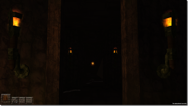
This was a fun chance to test out procedural world building, in a horror maze game (with sound this time).  Final coding and gameplay by yours truly:

HorrorMaze_BuildL04 2014-07-30 11-37-44-10HorrorMaze_BuildL04 2014-07-30 11-37-51-35

Play Horror Maze Prototype


FEATURES

Procedural World Building

5 Rooms, 10 Room Contents, Infinite Mazes

At the start of each level a new maze is made, constructed from a series of room-prefabs, filled with a series of room-content-prefabs, and laid out so that:

  • All doorways align and all outermost edges are solid walls.
  • There are many more doorways near the centre (spawn) and more dead ends further out.
  • One chest appears near the centre and a few keys appear further out.
  • Each room has a chance of either slowing the player or spawning ghosts, chances based on room-content.
  • The NavMesh for enemy pathfinding is updated for these rooms with these contents, for the sake of…

...g-g-ghost!


Pathfinding

This was something had never done before but turned out to be infinitely less of a nightmare than expected (thanks mainly to Unity doing the heavy lifting).

Pathfinding was researched and made fully operational by current AIE Games students Jesse Killkelly-Munro, McMouny Heng and Peter Boutros, and then implemented into the procedural maze builder by yours truly.  The pathfinding is based on Unity’s NavMesh system (with NavMesh carvers included in the prefabs) to give basic enemy pathfinding around the procedural maze and it’s content.  Added to my list of ‘thing’s to make tutorials on ASAP.’


Planned Features

The procedural generation was the main thing I was happy with, and am looking forward to taking much further, using it next to randomly build and place content around a house for a ‘haunted house’ game.  The plan is to take the system of random room and content generation, and make it work to create a randomised layout for a two storey house, placing furniture and rooms in locations that are natural, but slightly different for every playthrough.  Should be a fun challenge.


Full Attributions

Original concept, enemy models and animations by Jacob Clerke.

GUI elements by Kirby Hodgson

Sounds sourced by Jesse Killkelly-Munro and Tristian Blake

Prop models and textures by Chris Park and Tristian Blake

Room textures by Tristian Blake

Set dressing by Tristian Blake

Coding and gameplay prototyping by Jesse Killkelly-Munro, McMouny Heng and Peter Boutros

Coding and gameplay (final) by Lex Wills


Sound Attributions

All located by Jesse Killkelly-Munro and selected by Tristian Blake

Music, 'Dark Tension' by Music4Tv

Danger, 'Heartbeat Sound Effect 05', by SoundJay.com

Player Footsteps, 'Footsteps 5' by Pacdv.com

Ghost Spawning Sound 1 of 2, by The Cheese Man

Ghost Spawning Sound 2 of 2, by Mike Koenig

Ghost Attack Sound, by SoundDogs.com

Hit Sound 1 of 4, by CGeffex

Hit Sound 2 of 4, by Mark DiAngelo

Hit Sound 3 of 4, by Mark DiAngelo

Hit Sound 4 of 4, by Mike Koenig

Chest Locked, 'Door Locked Sound Effect 1' by SoundJay.com

Chest Unlocked, 'Door Locked Sound Effect 2' by SoundJay.com

Key Pickup Sound, 'Desk Bell' by Stuart Duffield

Scare/Slow (Minor) Sound, by Mike Koenig

Scare/Slow (Major) Sound, by Titus Calen

All sound effects used in a not-for-profit capacity.

Friday, 18 July 2014

2 Day Prototype: Super

One of my pet passions is Super Heroes – not what they are usually shown to be, but what they could be, and especially, where is the line between ‘good’ and ‘evil.’  A question that became:
Screenshot of main interface
Art and story by Tristian Blake, coding by Lex Wills, animations (not yet featured) by Jacob Clerke.

Super - Click to Play

Warning: button presses occasionally won’t work at start-up, but resizing the window will fix this.  Apparently this is a long-running issue with Unity’s Web Player’s integration with Google Chrome, but it’s number one on my list of things to find a consistent solution for.

FEATURES

Pseudo-Infinite Events

Pseudo-infinite because there’s currently only twelve.  Pseudo-infinite because these twelve events are written in the following adaptive form:

[On your way past] [famous location] you pass a [bad] [bad character] in the process of mugging an unarmed [character]. [You]...

Everything in [square brackets] is a tag, which can be replaced with a random entry from a pre-defined list.  So for example, the above line can appear as any of the following:

On your way past Sydney University, you pass a shouting robber in the process of mugging an unarmed citizen.  You…
While passing Centrepoint Tower, you pass an inexperienced thug in the process of mugging an unarmed woman.  Quickly, you…
Eating lunch by Olympic Park Stadium, you pass a hardened granny in the process of mugging an unarmed teenager.  Knowing it’s your duty, you…

And so on, combining different details to make the same events have different specifics, some of which are hilarious (e.g. On your way home, you pass a young child on the street, putting up LOST posters for her pet fuzzy tarantula, Cuddles.)
Hopefully when we’ve added more events to the database (e.g. about 50 or more), then the effect will be such that the player won’t even recognize the same event appearing twice (especially given the system enforces a gap of totalEvents / 2 before an event appear again, so for example with 50 events the minimum gap between occurrences of the “mugging” would be 25 events).
We’re also looking forward to using this system as the basis for a variety of other text/story based event-games.  Oh the possibilities!

No ‘Evil’ Trait

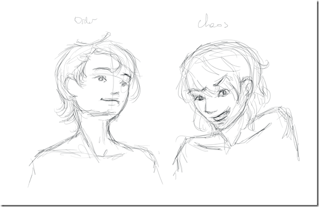
Order vs Chaos
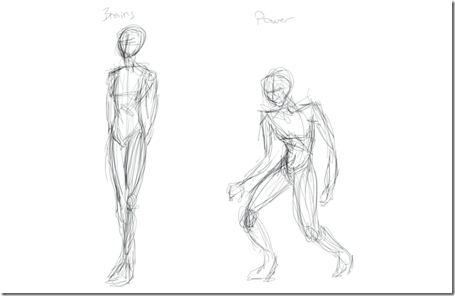
Brains vs Power
Toughness vs Speed
Legend vs Mystery
These were the four ranges we felt (after lots of heated ‘discussion’) would best define the broadest range of heroes and villains.  AND NOWHERE APPEARS ‘Good vs Evil,’ (though Order vs Chaos comes a little close).
This is because, we believe, ‘Good vs Evil’ is a drastic oversimplification.  Few undeniably ‘evil’ people do what they do because they genuinely believe it is the WRONG thing to do.  People invariably feel their actions are justified, and have a basis in reality, even if that reality exists only to them.  There are of course very notable exceptions:
But even for those supers whose sole purpose in life is to have fun, we wanted to try and define them not by a label of ‘good’ or ‘evil,’ but by who they actually are.
For example, Superman would have very high Order, believing there is a ‘right way’ to do things, and high ‘Legend’, being a highly visible moral figure in the community.  Alternatively Batman would lean a little more towards ‘Chaos’, as he doesn’t always play by the rules, with high ‘Mystery’, given there are many times during his stories where people plausibly believe he doesn’t even exist, and if he does, they know very little about him.
The Joker would have EXTREMELY high Chaos: he just wants to watch the world burn (while Deadpool toasts marshmallows), while Lex Luthor would have high Order: he believe there is a right way to do things (even though that way is NOT the same as Superman’s, whom Lex believes to be a threat to humanity only he himself can see).
Of course all of these strengths have a flipside weakness – the Hulk would have maximum Power and Toughness, at the expense of Brains and Speed.  Alternatively the Flash would have the highest possible Speed, and no Toughness.
These traits already effect the chance of success for different choices: two traits always make is easier to achieve a given choice, while sometimes an extra (unseen but logical) one makes its harder: e.g. it’s hard to give an impassioned appeal to a criminal’s morality if you yourself are a known madman.  But, their is another planned use for these traits, one that promises to be more visually awesome:

Planned Features

Avatar Evolution

One of the features that didn’t make it in to the two-day prototype was visible, game-driven avatar-customization (Unfortunately ran out of time to integrate Jason Clerke’s test animations before prototype was due, so needed to go with 2d placeholder).
In the final game, full 3d avatar-customization will be based around showing a) a 3d environment behind the avatar, as their ‘super hideout’ evolves from an apartment, into a full super-cave, and b) showing a 3d model of the player’s super character, posed and performing a looped idle animation.  But the specifics of all this will depend on what kind of super they’ve become.
As the game evolves, and you acquire more fame and money, your outfit evolves from something that looks like you made it yourself, to a full shining super-suit.  But what does this suit look like?  Is it bright and vibrant, showing you to be the Legend of Order you are.  Or is it muted, dark, and covered in equal damage and weapons, showing you to be the skulking Mysterious Chaos lord you are?
And how do you stand?  Do you stand upright, arms behind back (Brains) or hunched, fists and muscles tensed (Power)?  Are a well-defined (Toughness) muscular (Power) body-builder, or are you a scrawny (Brains) lithe (Speed) athlete?
Order vs Chaos (Expression Concept)
order vs chaos
Brains vs Power (Stance Concept)
brains vs power
Speed vs Toughness  (Physical Concept)
speed vs toughness
Legend vs Mystery  (Lighting Concept)
legend vs mystery
Your traits, and thus your choices that gave you those traits, determine who you are – how you look, stand, are lit, and fill out your suit.  This will be achieved through the use of four parts: Unity’s Mechanim for animation blending, ShaderForge for shader creation and customization, a custom script for camera-angles and lighting, and finally a custom multi-character rig made by yours truly. The goal of all this being to have the game show you your super, evolving from the same base person, into the person your choices have made.

Fame, Funds and Health Usage

Currently ‘Fame’, ‘Funds’ and ‘Health’ have no use other than numbers.  They will, however, determine the ongoing course of the game.
In the final game your funds will be used to manage your life, pay rent, hospital bills, etc, showing how difficult it is to keep going as a full-time super with a real life.  This will make it difficult to be completely selfless – yes you’d like to say, oh no need to thank me mayor, all in a day’s work… but how many days has it been since you ate?
Fame is how famous you are – how many people know your name (for better or worse), and is used to determine the progression of the game and its story (only the most famous heroes get to save the entire world after all).
And health – every act of heroism costs at least some health, tiring you out.  The less health you have, the worse your condition, and the harder it is to succeed.  You can only keep going for so long before you have to sleep, and recover yourself.  This will be another place where funds come in, allowing you to buy things like a better bed, or later a full regenerative-chamber, to heal you more, as well as buying better armour, med kits, etc, that will boost your ongoing resistance to damage.  Managing your health versus your desire to just keep going will be part of the game’s difficulty.

So that’s the plans.  More events are also planned, with things like ‘Your day-job boss demands you explain your CONSTANT sudden absences. How do you avoid getting fired?,’ the start and ongoing difficulty of having a relationship while leading a double-life, family-interactions, etc, integrating the character into their own ongoing story that evolves right up until the end game – which begins with the appearance of your arch-nemesis, the specifics of whom we’re keeping our own little secret.
Hopefully this has excited you as much as it has done us!  There’s much to do, but to date everything has gone so well we can’t wait to continue, as this is a game we desperately want to play.  It just needs to exist first.
Tuesday, 15 July 2014

2 Prototype: Zappy Orbs

Several first in one: my first major prototype made in Playmaker and my first look at Unity Particles.  The result:

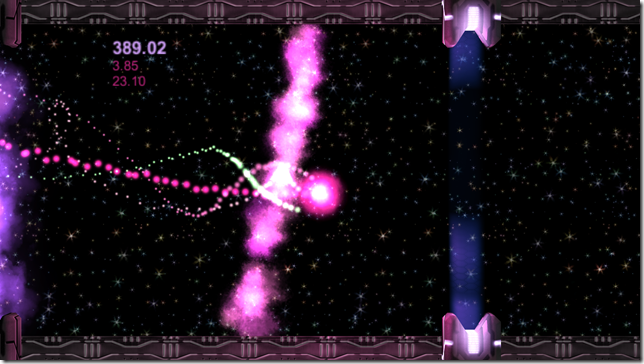
Lex Wills, Zappy Orbs, Image 01Lex Wills, Zappy Orbs, Image 02Lex Wills, Zappy Orbs, Image 03

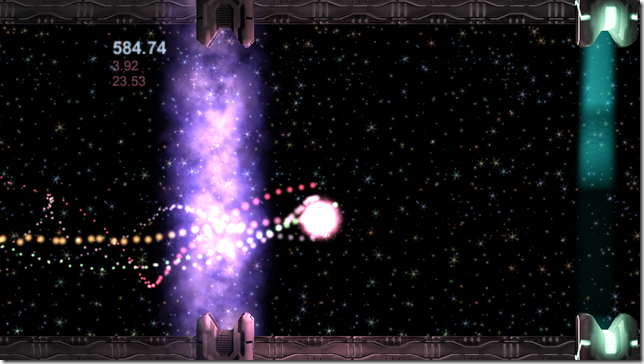
Made over a weekend as a test of concept, to see if could take the then infamous Flappy Birds mechanic, a simple yet addictive physics-based challenge, and quickly redevelop it, taking advantage of Unity particles and Strumpy animated Shaders to make the game a visual treat.

I also wanted to see if I could take the core mechanics and controls of Flappy Birds and improve them, refining the physics and controls and adding behind-the-scene player assistance that would, subtly and invisibly to the player, allow the game to be pushed to entirely new heights.  This was done through the redesign of:


Control and Death

Unlike in the original Flappy Birds, the single-button control (mouse button or touch-pad touch) could be held down and released for constant force – a simple change, but one that produced much smoother control over the position of the orb as it moved ever onwards.

Hitting the top or bottom of the screen, or hitting any part of a shield-wall other than the darker gap, would result in death.  A nice explosive death:

Lex Wills, Zappy Orbs, Image 04

BUT, unlike in the original, in here it was made possible to gain more than one life.

Passing safely through the gap in a gate would destroy the gate, causing a nice colour-explosion, changing the colour of the player to an average of their current colour and the gate’s colour, and making the player grow a little larger.

Passing five gates in a row would make the player shrink again, revealing a new, smaller orb orbiting the main one – a second life.

After this point if the player hit the top/bottom or gates, they would simply lose a life (causing a colour-explosion based on that life, and the loss of that orb), only losing the game if they lost all lives and then crashed.

Lex Wills, Zappy Orbs, Image 05

This simple change gave more room for error with increased play time, and with it, more room to push the mechanics and challenge as the game progressed, especially:


Speed and Assistance

Every new life gained made you go faster, and faster, and faster!

Lex Wills, Zappy Orbs, Image 06

But with increased speed, the player’s physics and control were subtly altered, increasing with speed so that the player always felt like they had the same amount of overall control, just less reaction time.

Additionally, though every new gate came in with its gap at a random height, the distance between the gaps of the last gate and the next gate would gradually shrink with speed.  What this meant was that, as the player got faster and faster there was less chance of being foiled by two gates impossibly close together with vastly different heights.  In fact with extreme speed the gates would even start to line up more, making the player have to shift from big movement to finer control of a speeding object, feeling ever more accomplished for successfully controlling this ever faster going orb.

In fact these behind-the-scenes tweaks soon made it possible for repeating players that had practiced the game’s controls were able to start to achieve high numbers of lives, and with it ludicrously high speed.  More challenge was needed, so a second game-stage was added.

Lex Wills, Zappy Orbs, Image 07Lex Wills, Zappy Orbs, Image 08Lex Wills, Zappy Orbs, Image 09

Taking reference from sonic-boom effects, with enough speed the player would be chased by a wave of light, building up behind them, compressing, and eventually breaking in a rainbow explosion, as the player broke through the speed of light.

Lex Wills, Zappy Orbs, Image 10

Here the background would change to a fast-rushing star-field, a slight colour-gradient overlay showing the path you should travel, as at this point the visuals and the gates themselves were flashing past so insanely fast as to be indistinguishable, becoming one long tunnel of rushing colour.  Following the shown path was the only way to avoid a mistake, which be explosively fatal (shown later).  But holding your course and getting faster and faster would eventually lead you to…


The Endgame

Where you are going so fast …

Lex Wills, Zappy Orbs, Image 11

… you break through …

Lex Wills, Zappy Orbs, Image 12

… space-time itself …

Lex Wills, Zappy Orbs, Image 13

… winning the game.

Lex Wills, Zappy Orbs, Image 14Lex Wills, Zappy Orbs, Image 15Lex Wills, Zappy Orbs, Image 16


Overall, a fun, simple, and above all quick prototype, testing the use both of visuals and of more refined controls and player-assisting mechanics behind the scenes to push the Flappy Birds core mechanics to ludicrous speeds.  And if, once achieving said speeds, you wanted to see how spectacular the crash would be:

Lex Wills, Zappy Orbs, Image 17

As mentioned, hitting the top or bottom during the second stage was explosively fatal.

Before this stage, if the player hit the top or bottom then they would bounce, losing one life but usually being able to regain control before losing a second.

After this stage, if the player hit the top or bottom they would BOUNCE, fast and hard enough to immediately hit the other side, then the other and other again, back and forth, a coloured life exploding every time and – well you can see above, but a static image doesn’t quiet convey the sensation of coloured shockwaves exploding at every angle in a few glorious seconds of light.  Aaah, the other, just as colourful way to end the game.  Speaking of which:


Downloads

The game can be downloaded and played here:

Download: ZappyOrbs (32 Bit Version)

Download: ZappyOrbs (64 Bit Version)

These are zip archives – unzip to your computer, open the folder and run the exe file (setting resolution to 1920x1080).  A less than ideal way of playing it, due to:


Disclaimer: These are still the rapidly made versions, constructed using Playmaker as a quick test of concept only, and my first Playmaker prototypes.  As such, they are far from perfect – most notably in the final update the game began producing a moment of lag whenever a gate was passed, something that previously had not occurred.  Due to this being intended as a rapid prototype only, the source of this performance bug was not corrected.

However, I will be posting new versions of the game here asap, versions that are properly recoded in C# and take advantage of what I’ve learned since then (for example, the benefit of using trail-renderers for solid trails, rather than ultra-dense particle streams).  These new versions will also be made specifically for the Unity web-player, so that they can be played directly on this website without any downloading and configuring – just click to play.

These updated versions will be posted here soon – as soon as have finished getting up to date with posting my other prototypes, art, tools and other projects.

Monday, 14 July 2014

Creature: Fluffy

The "Fluffy" hero asset was originally created for a three-week student production, directed by yours truly.

Lex Wills, Fluffy Asset, RoarLex Wills, Fluffy Asset, Hopeful[8]

The original idea was for a creature that could be both terrifying and adorable.  The design was heavily inspired by the Dragonbat appearing briefly in Joss Whedon's Cabin in the Woods, various species of bat, as well as extensive prodding of my three house-cats.

The topology, rigging and skinning of the face, the shading, lighting, comping, original concept and direction were the work of Lex Wills.


DeSIGN AND DEVELOPMENT

Jaw

The split-jaw design allows Fluffy to open a horrifyingly wide gullet, and then later to close the same gullet into a feline-small chin.  The teeth were references from meat-eating hunters, recreating both the pair of saber-style killing teeth and triangular-blade back teeth which we unconsciously associate with dangerous carnivores.

Making the long tongue back roll into the mouth was a particular challenge.

Lex Wills, Fluffy Asset, Tongue

Ears

An animals ears can give such an enormous range of expression, especially for large, articulate ears.  To achieve this here, exhaustive reference was studied of the anatomical structures that allow bat and feline ears to prick, fold and rotate (with a fair amount of fiddling with my own cats’ ears too), all to make Fluffy’s massive ears look like they realistically could achieve their enormous range of movement: from flat backwards (above) in aggression/fear, to dropping down past shoulders in sadness and pricking straight up in surprise.

Lex Wills, Fluffy Asset, Sad EarsLex Wills, Fluffy Asset, Ears


Eyes

The eyes were another important part, needing to be able to shrink to pinprick-pupils in veiny eye-whites (horror technique to creature fear by showing it in another’s eyes) all the way to massively flooded, adorable cow-eyes where the pupil dominated most of the eye.  A custom eye rig was made to achieve this, the colours, vein, reflectivity and many other setting extensively tested to achieve the most dynamic look.

Lex Wills, Fluffy Asset, Eye DevelopmentLex Wills, Fluffy Asset, TongueLex Wills, Fluffy Asset, Hopeful

Then began…

Post Processing

With such a short project time, re-rendering the beauty passes was not feasible, allowing only one chance to get it right.  At least it would have done, were it not for the magic of Nuke.

To ensure that I still had very fine control over every part and every detail of the image, twelve additional matt-ID layers were also made (alongside the more usual Fresnel, AO and Reflection passes).  All these matt-ID layers were ultra-fast to render and gave ultra-fine tuning over every individual element you see below, right up until the final submission.

Lex Wills, Fluffy Asset, Render Layers

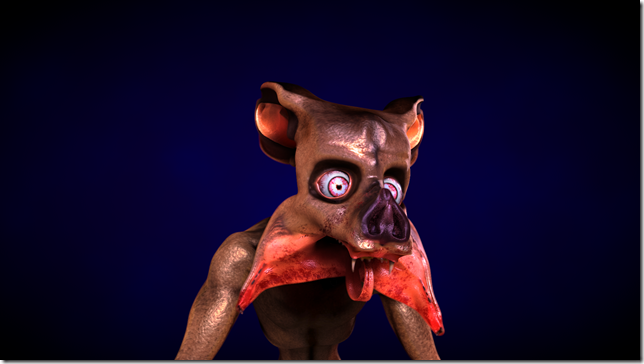
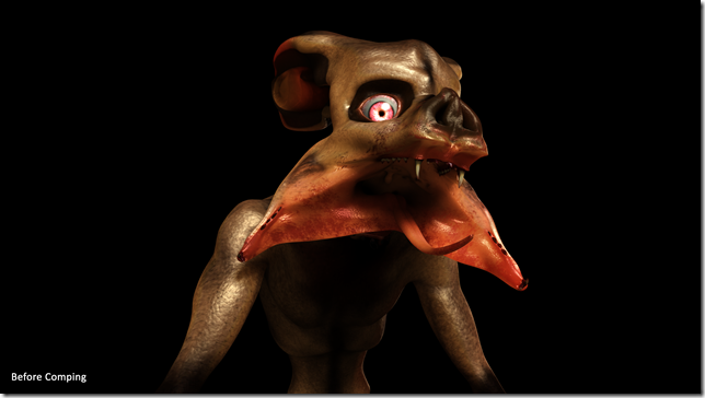
Lex Wills, Fluffy Asset, Before CompingLex Wills, Fluffy Asset, After Comping

The Nuke script that achieved this will be uploaded here shortly, in the hopes that it will be useful a fun introduction tutorial to rgb-masking in Nuke.

Wednesday, 9 July 2014

Characters: Ksthhra and Cindy

Ksthhra Thheln (the serpent) was my first high-poly character ever created.  At the end of second year I retextured this character, taking care not to alter the original, very limited geometry, to see how far could push the quality of textures on a less than perfect model.

Cindeca "Cindy" Orailea (the Princess) was sculpted and rigged by Stefanie Boensch as the star for Fairytale Ending, with SSS and hair maps were provided by Helen Michaels.  Everything else: the shading, clothing modelling and topology, lighting, comping, texturing and posing, is the work of yours truly.

A turn-around of this pose would become the opening-piece for my 2013 Showreel, available: here.


Development Process

Part 1 - Flesh and Blood

One of the biggest challenges was achieving the look of dead skin - not just poorly shaded or plastic skin, but skin that was formerly alive. In response to feedback the specular was greatly reduced and the shade increased, but what ultimately achieved the effect was removing the sub-dermal layer from the SSS shader (as if the blood beneath the skin had been drained away).

Trying to achieve the look of a soft-scaled, originally aquatic serpent went through many iterations. The colour pallet also had to match AND contrast the armour. This was deliberate, as even though the skin and hair of human knights does not match the colours of their steel armour, the same can rarely be said of science-fiction characters.

Many variations were tried to achieve the look of a stab-wound: bleeding underneath, over and through fabric, with the edges of showing signs of burns from the high-tech energy blade that caused the wound. Extensive reference was collected both of wounds and bloodstained fabric to try and make both look as realistic as possible.


Part 2 - Clothing

The armour designs convey the mythos of the wearer's race, featuring immense, space-faring serpents as a focus of worship and as a creation myth. Their styled forms appear in various places on the armour, within the central symbols on chest and forehead, and in several characters of the scripts of both.

As mentioned in a previous post, the in-progress dress was used for a quick, humorous 'design-a-minion' contest.  The final shadows and textures of the dress were much more carefully detailed, the goal being to have it appear as finely detailed as Ksthhra's armour, but much softer, richer, the fabrics expensive and delicate and all using warm colours to contrast the electric blue lighting of the armour.  The only exception to these warm colours was the inclusion of a single blue flower over the heart, whose purpose was to show a previous, chosen connection between these two characters in defiance of tradition.

The gold details and bodice thread were actually given a very small amount of glow to make them stand out that much more in the final shot.  Thus why the dress is never seen in low light in these shots (or the glow becomes obvious).


Part 3 - The Eyes

The eyes went through many iterations trying to achieve a good colour.  Eventually a trick was employed that is commonly used in fantasy contact-lenses - making the edges artificially dark, so that the lighter interiors are beautifully bright by contrast.  In hindsight a little too much purple may have been used, but this appears much less noticeable in the final composition, where it adds a little much needed warmth to the otherwise cold blue eyes.

Of note here is the flakiness of the skin, caused by to the normals being increased very high.  This was necessary to make the dead-looking skin appear more real and less plastic when seen from middle to far distances, with close distances having the effect reduced in:


Part 4 - Post-Production

Many tweaks like this were done in post-processing, with much work done to emphasize the fine details of the clothing and characters, and also to try and achieve an overall pleasing colour composition.  The various stages of post-processing, and the maps/layers used, are shown below.


Part 5 - Posing

The pose, as the emotional focus of the work, was exhaustively referenced and tested.  Initial reference for posing was taken both from theatrical and artistic exaggeration, as well as from real-life footage.

The early posing unintentionally over-emphasized the sharpness and dangerousness of Ksthhra. Additionally, the skin shader for the Princess was far from sufficient, and was completely entirely redesigned.

Here the process took a major casualty. The sword, which delivered the fatal stab wound, was originally seen in shot still fatally impaling the Princess.  The blade of the sword also featured one of the most beautiful shaders I have yet achieved, with the blade transitioning from glowing hot plasma to folded metal that, when the light hit it just right, rippled rainbow light across the folds and patterns worked into the blade.  But feedback from multiple sources confirmed that the sword’s inclusion made the composition much more brutal than tragic, necessitating the sword be removed in its entirety.

Feedback had many people misreading the pose as the moment before an attack or eating.  To try and downplay the potential for aggression and danger, the pose was redesigned into a softer, more classical romance pose, de-emphasizing sharpness and emphasizing curves and union. Several camera angles were tested, and many of them were incorporated into the video turnaround.


Part 6 – Done

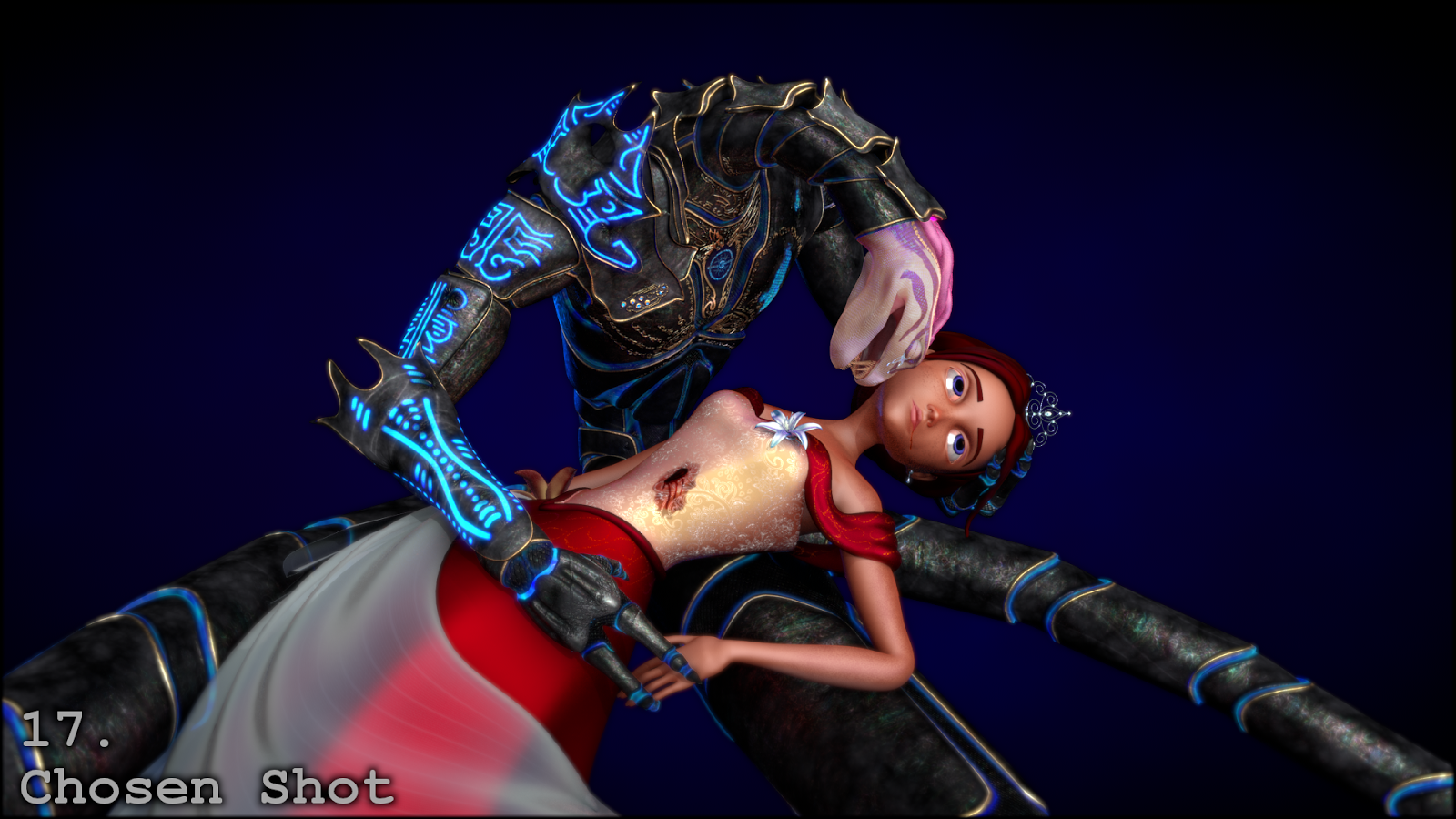
At long last, the chosen pose and camera angle, after all post-processing changes, became:

And speaking of post-processing, the next project was full of it...