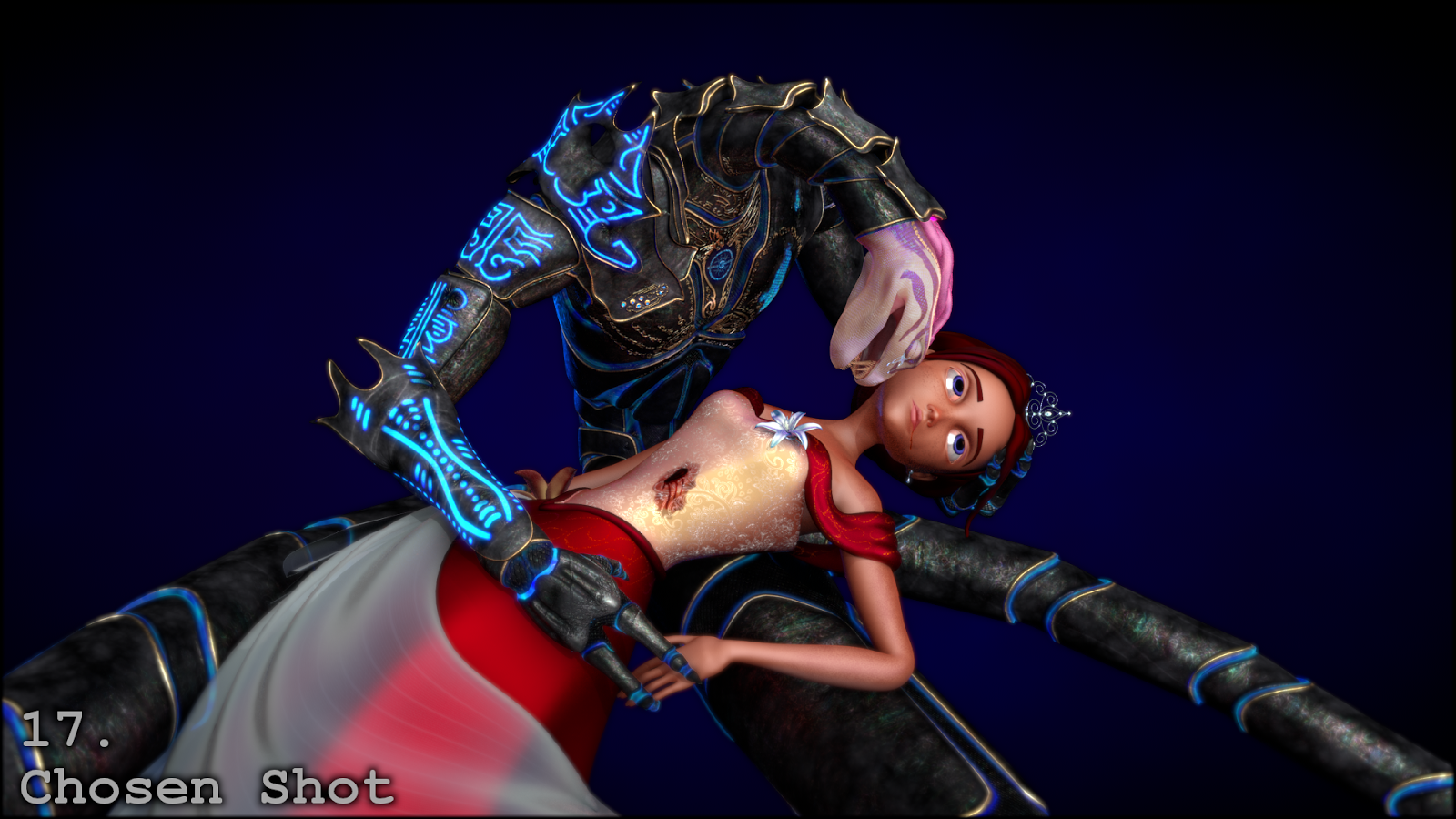
Ksthhra Thheln (the serpent) was my first high-poly character ever created. At the end of second year I retextured this character, taking care not to alter the original, very limited geometry, to see how far could push the quality of textures on a less than perfect model.
Cindeca "Cindy" Orailea (the Princess) was sculpted and rigged by Stefanie Boensch as the star for Fairytale Ending, with SSS and hair maps were provided by Helen Michaels. Everything else: the shading, clothing modelling and topology, lighting, comping, texturing and posing, is the work of yours truly.

A turn-around of this pose would become the opening-piece for my 2013 Showreel, available: here.
Development Process
Part 1 - Flesh and Blood
One of the biggest challenges was achieving the look of dead skin - not just poorly shaded or plastic skin, but skin that was formerly alive. In response to feedback the specular was greatly reduced and the shade increased, but what ultimately achieved the effect was removing the sub-dermal layer from the SSS shader (as if the blood beneath the skin had been drained away).
Trying to achieve the look of a soft-scaled, originally aquatic serpent went through many iterations. The colour pallet also had to match AND contrast the armour. This was deliberate, as even though the skin and hair of human knights does not match the colours of their steel armour, the same can rarely be said of science-fiction characters.
Many variations were tried to achieve the look of a stab-wound: bleeding underneath, over and through fabric, with the edges of showing signs of burns from the high-tech energy blade that caused the wound. Extensive reference was collected both of wounds and bloodstained fabric to try and make both look as realistic as possible.
Part 2 - Clothing
The armour designs convey the mythos of the wearer's race, featuring immense, space-faring serpents as a focus of worship and as a creation myth. Their styled forms appear in various places on the armour, within the central symbols on chest and forehead, and in several characters of the scripts of both.
As mentioned in a previous post, the in-progress dress was used for a quick, humorous 'design-a-minion' contest. The final shadows and textures of the dress were much more carefully detailed, the goal being to have it appear as finely detailed as Ksthhra's armour, but much softer, richer, the fabrics expensive and delicate and all using warm colours to contrast the electric blue lighting of the armour. The only exception to these warm colours was the inclusion of a single blue flower over the heart, whose purpose was to show a previous, chosen connection between these two characters in defiance of tradition.
The gold details and bodice thread were actually given a very small amount of glow to make them stand out that much more in the final shot. Thus why the dress is never seen in low light in these shots (or the glow becomes obvious).
Part 3 - The Eyes
The eyes went through many iterations trying to achieve a good colour. Eventually a trick was employed that is commonly used in fantasy contact-lenses - making the edges artificially dark, so that the lighter interiors are beautifully bright by contrast. In hindsight a little too much purple may have been used, but this appears much less noticeable in the final composition, where it adds a little much needed warmth to the otherwise cold blue eyes.
Of note here is the flakiness of the skin, caused by to the normals being increased very high. This was necessary to make the dead-looking skin appear more real and less plastic when seen from middle to far distances, with close distances having the effect reduced in:
Part 4 - Post-Production
Many tweaks like this were done in post-processing, with much work done to emphasize the fine details of the clothing and characters, and also to try and achieve an overall pleasing colour composition. The various stages of post-processing, and the maps/layers used, are shown below.
Part 5 - Posing
The pose, as the emotional focus of the work, was exhaustively referenced and tested. Initial reference for posing was taken both from theatrical and artistic exaggeration, as well as from real-life footage.
The early posing unintentionally over-emphasized the sharpness and dangerousness of Ksthhra. Additionally, the skin shader for the Princess was far from sufficient, and was completely entirely redesigned.
Here the process took a major casualty. The sword, which delivered the fatal stab wound, was originally seen in shot still fatally impaling the Princess. The blade of the sword also featured one of the most beautiful shaders I have yet achieved, with the blade transitioning from glowing hot plasma to folded metal that, when the light hit it just right, rippled rainbow light across the folds and patterns worked into the blade. But feedback from multiple sources confirmed that the sword’s inclusion made the composition much more brutal than tragic, necessitating the sword be removed in its entirety.
Feedback had many people misreading the pose as the moment before an attack or eating. To try and downplay the potential for aggression and danger, the pose was redesigned into a softer, more classical romance pose, de-emphasizing sharpness and emphasizing curves and union. Several camera angles were tested, and many of them were incorporated into the video turnaround.
Part 6 – Done
At long last, the chosen pose and camera angle, after all post-processing changes, became:
And speaking of post-processing, the next project was full of it...


No comments:
Post a Comment